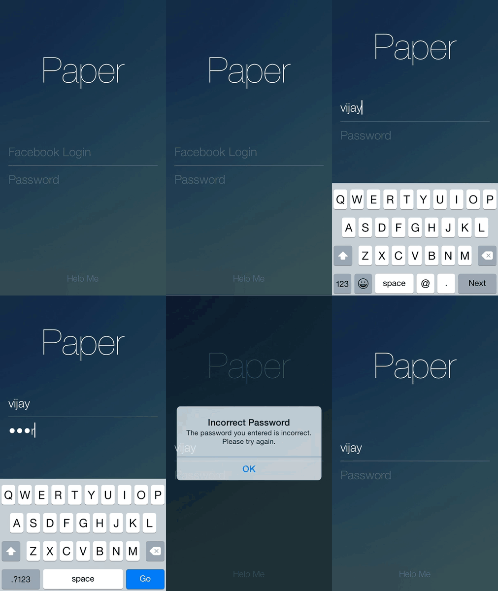
Login screens are found in a lot apps these days. I feel like the login screens that are out there are often put together as an after thought. Don’t get me wrong, I’m no designer, but do login screens really need to be boring? They’re the first screen that your user sees, so why not make it feel like you spent more than an afternoon putting one together?
I finally got around to installing Facebook’s Paper app on my iPhone, and it was one of the first apps that I thought had a nice, clean login screen.

It’s not much, but it does a few things that I think are rather nice
- Animates up when the title, username and password fields when the keyboard is displayed
- Hides the keyboard when the user clicks anywhere
- No Login button
- Hides the status bar
So I decided to see if I could reproduce the same screen. In this article, I’ll implement the screen for iOS using Objective-C and Auto-Layout. I’m also going to do all of this in code; Just makes explaining things easier. I’m also assuming the reader already has some familiarity with Auto-layout.
Create all the things
To start, I created all the UI elements I need for this screen. From the Paper app itself, it looks like there’s a title, two text fields, and a separator between the textfields. I’ll also create an array which will hold the different constraints shown depending on if the keyboard is shown or not.
#import "PaperLoginViewController.h"

@interface PaperLoginViewController() <UITextFieldDelegate>

@property (strong, nonatomic) UILabel *titleLabel;
@property (strong, nonatomic) UITextField *usernameField;
@property (strong, nonatomic) UITextField *passwordField;
@property (strong, nonatomic) UIView *separator;

@property (strong, nonatomic) NSMutableArray *keyboardShownConstraints;
@property (strong, nonatomic) NSMutableArray *keyboardHiddenConstraints;

@end
I initialized all the fields in code. I’m sure all the properties I set could have been done in a story board or xib in some way, but I put it all in code. Notice how my controller also conforms to the UITextFieldDelegate? I’ll explain why in a bit. I decided to use a UIView as a separator because… well… I don’t know of another way of doing it. If someone out there in internet land wants to suggesting something else, then please leave a comment.
Laying things out
Since I want the layout to animate, I decided to create and store the constraints in code. I created two arrays which represent the constraints based on some state of the view. These were the constraints I applied
// In viewDidLoad

NSDictionary *views = @{
    @"title": _titleLabel,
    @"username": _usernameField,
    @"password": _passwordField,
    @"separator": _separator
};

NSLayoutConstraint *titleCenter = [NSLayoutConstraint
	constraintWithItem:_titleLabel
		attribute:NSLayoutAttributeCenterX
		relatedBy:NSLayoutRelationEqual
		toItem:self.view
		attribute:NSLayoutAttributeCenterX
		multiplier:1.0 constant:0.0f];

NSArray *verticalConstraints = [NSLayoutConstraint
	constraintsWithVisualFormat:@"V:|-top-[title]-space-[username]-(8)-[separator(1)]-(8)-[password]"
                       options:kNilOptions
                       metrics:@{
                         @"top": @(120),
                         @"space": @(100)
                       }
                       views:views];

NSArray *usernameHorizontalConstraints = [NSLayoutConstraint
    constraintsWithVisualFormat:@"H:|-[username]-|"
    options:kNilOptions
    metrics:nil
    views:views];

NSArray *separatorHorizontalConstraints = [NSLayoutConstraint
	constraintsWithVisualFormat:@"H:|-[separator]-|"
	options:kNilOptions
	metrics:nil
	views:views];

NSArray *passwordHorizontalConstraints = [NSLayoutConstraint
	constraintsWithVisualFormat:@"H:|-[password]-|"
	options:kNilOptions
	metrics:nil
	views:views];

_keyboardHiddenConstraints = [NSMutableArray array];
[_keyboardHiddenConstraints addObject:titleCenter];
[_keyboardHiddenConstraints addObjectsFromArray:verticalConstraints];
[_keyboardHiddenConstraints addObjectsFromArray:usernameHorizontalConstraints];
[_keyboardHiddenConstraints addObjectsFromArray:separatorHorizontalConstraints];
[_keyboardHiddenConstraints addObjectsFromArray:passwordHorizontalConstraints];

verticalConstraints = [NSLayoutConstraint
    constraintsWithVisualFormat:@"V:|-top-[title]-space-[username]-(8)-[separator(1)]-(8)-[password]"
                       options:kNilOptions
                       metrics:@{
                                 @"top": @(70),
                                 @"space": @(40)
                                 }
                       views:views];

_keyboardShownConstraints = [NSMutableArray array];
[_keyboardShownConstraints addObject:titleCenter];
[_keyboardShownConstraints addObjectsFromArray:verticalConstraints];
[_keyboardShownConstraints addObjectsFromArray:usernameHorizontalConstraints];
[_keyboardShownConstraints addObjectsFromArray:separatorHorizontalConstraints];
[_keyboardShownConstraints addObjectsFromArray:passwordHorizontalConstraints];

[self.view addConstraints:_keyboardHiddenConstraints];
There’s a lot going on here. The gist of it is, vertically, I centered the label to the screen, stacking the other UI elements below it with some spacing. Horizontally, I’m just stretching the text fields and separators from one edge to the other edge of the screen. I store those constraints in the keyboardHiddenConstraints object. When the keyboard is up, you’ll notice that the only thing that’s really different is the top and spacing between elements. So I store all the same constraints as the keyboardHiddenConstraints except I redefined the verticalConstraints when the keyboard is shown.
I also give the root view the constraints defined for a hidden keyboard. I believe this is how the Paper app does it, although it could be argued that the username field should have been the first responder when this page is shown.
Animating the views
I wanted to animate the UI elements when the keyboard displays itself. This is pretty straight forward in iOS7, simply added the controller as a target to the events through the NSNotificationCenter
// In viewDidLoad

[[NSNotificationCenter defaultCenter]
	addObserver:self
	   selector:@selector(keyboardWillShow:)
           name:UIKeyboardWillShowNotification
  		 object:nil];

[[NSNotificationCenter defaultCenter]
	addObserver:self
	   selector:@selector(keyboardWillHide:)
	       name:UIKeyboardWillHideNotification
	     object:nil];
Now to animate the views, I simply implement the above methods as follows:
- (void)keyboardWillShow:(NSNotification *)notification {
    [self.view removeConstraints:_keyboardHiddenConstraints];
    [self.view addConstraints:_keyboardShownConstraints];
    [UIView animateWithDuration:0.3f animations:^{
        [self.view layoutIfNeeded];
    }];
}

- (void)keyboardWillHide:(NSNotification *)notification {
    [self.view removeConstraints:_keyboardShownConstraints];
    [self.view addConstraints:_keyboardHiddenConstraints];
    [UIView animateWithDuration:0.3f animations:^{
        [self.view layoutIfNeeded];
    }];
}
That’s it! Easy na? It’s pretty clear what’s happening here, I simply remove the constraints that were applied, and apply the constraints I want when the keyboard is either showing or hiding. The most interesting part is calling self.view layoutIfNeeded in an animation block. By simply calling this method inside of an animation block and UIKit, Core Animation, and Auto Layout handle the rest.
Hiding the keyboard
In the Paper app, they have a Help button located at the bottom of the page. I didn’t add one. However, Paper wanted to give its users a way to get to the button if the keyboard happens to be covering it. So they allow the users to dismiss the keyboard by tapping anywhere else in the view. Implementing this is also trivial. I first add a gesture recognizer to the controller
// In viewDidLoad

UITapGestureRecognizer *tapRecognizer = [[UITapGestureRecognizer alloc]
                                         initWithTarget:self action:@selector(respondToTapGesture:)];
tapRecognizer.numberOfTapsRequired = 1;
[self.view addGestureRecognizer:tapRecognizer];
Once that was done, it was just a matter of resigning as the first responder from the textfields. I could keep track of who the actual responder is, and then only resign that one, but… you know.
- (void)respondToTapGesture:(id)obj {
    [_usernameField resignFirstResponder];
    [_passwordField resignFirstResponder];
}
Loging in
Recall I mentioned that the view controller conforms to the UITextFieldDelegate? I did that so the user could login by pressing the keyboard’s return key. I made it so the username textfield has a UIReturnKeyNext return key, and the password field has a UIReturnKeyGo. I simply implement the textFieldShouldReturn of the UITextFieldDelegate protocol as follows
- (BOOL)textFieldShouldReturn:(UITextField *)textField {
    if (textField == _usernameField) {
        [_passwordField becomeFirstResponder];
    } else if (textField == _passwordField) {
        [_passwordField resignFirstResponder];

        // TODO: Should go ahead with login
    }

    return YES;
}
The idea is, when the user presses Next from the username field, I move on to the password field as the first responder. Once the user presses Go on the password field, the network call should kick in. Note that I also set the enablesReturnKeyAutomatically on both the text field, forcing simple non-empty validation.
Hiding the status bar
If you look closely at Facebook’s app, you’ll notice that there’s no status bar. I’m not sure what the motivation exactly is. My best guess is that it interferes with the overall look of the login screen. In any case, hiding the status bar is pretty trivia on iOS7, and all I had to do was add the following to my controller.
- (BOOL)prefersStatusBarHidden {
    return YES;
}
Final Product
And here’s what I came out with

I don’t think it’s to bad. The full gist can be found here.
Improvements
- The biggest flaws are the fact that the screen doesn’t work in landscape. Try it. When you rotate, the screen is unusable. I think this isn’t terribly hard to fix, but would require doing some math to determine some of the constraint values and the font size. I also think that the displacement of UI elements when the keyboard is shown should be a function of how tall the keyboard is. Again, more math.
- If you play with the Paper app, you’ll notice that after the user presses Go to login, the title slides down, hides the text fields, and applies a shimmer to the title to indicate progress. I really like this effect, and will try to find a way to add it to the above gist, but I’ll also leave this as an exercise to the reader.

The best book on machine learning for iOS.

Work with CoreML? Then you need MLFairy.com.

Enjoy my content? Consider becoming a member of my patreon, and help me continue making content!